
The Movies of my Childhood, Coming in 2011: Tintin
By Jason Haggstrom, December 26, 2011
![]() What, exactly, does "Tintin" mean to you? There’s a very good chance that for you, "Tintin" is simply the title to Steven Spielberg’s new, mo-cap animated film that opened in theatres this past week… and nothing more. But for me "Tintin" isn’t just a funny sounding name for a character or movie. Tintin is a passion that has been with me for most of my life. Tintin was my gateway drug to the world of comics, a medium that I grew to adore as much as any other, and that I still love today.
What, exactly, does "Tintin" mean to you? There’s a very good chance that for you, "Tintin" is simply the title to Steven Spielberg’s new, mo-cap animated film that opened in theatres this past week… and nothing more. But for me "Tintin" isn’t just a funny sounding name for a character or movie. Tintin is a passion that has been with me for most of my life. Tintin was my gateway drug to the world of comics, a medium that I grew to adore as much as any other, and that I still love today.
Tintin in America is the first comic book that I can recall reading. Well, there had always been the comic strips in the daily newspaper, but that’s not quite the same. I discovered a few Adventures of Tintin books in a dark, neglected section of a local book store back in 1983 or ‘4. Back then, graphic novels and other comic collections just weren’t stocked at traditional book stores so finding comics—especially comics that I’d never even heard of—felt like a wondrously odd and magical discovery. I was in second grade—eight years old, or about to be. In the years that followed, I picked up copies of all the Adventures of Tintin books; I’ve probably read each of them a dozen times. And now, 28 years since my first encounter with the character, we have a Tintin movie created by one of our greatest filmmakers. My expectations for the film are high. Unreasonably so. No current film project is dearer to my heart than this one.
 I know that a lot of you are a bit baffled by this "Tintin" character. I’ve seen the puzzled expressions on people’s faces, and heard them talking about the film’s strange name. As Americans, we are often guilty of not realizing that worldwide phenomenons could exist without our inclusion or approval, and Tintin is most certainly the greatest case of such a phenomenon. Here’s a little background on Tintin for the uninitiated:
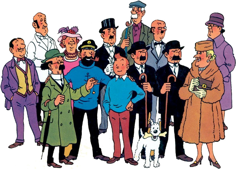
Tintin is the ultimate adventurer, not unlike Spielberg’s own Indiana Jones. The character is an ambitious, young, globetrotting reporter who always ends up as part of the story he’s attempting to cover. He is surrounded by a cast of flamboyant, colorful characters—most notably his faithful dog Snowy—who join him on his many adventures.
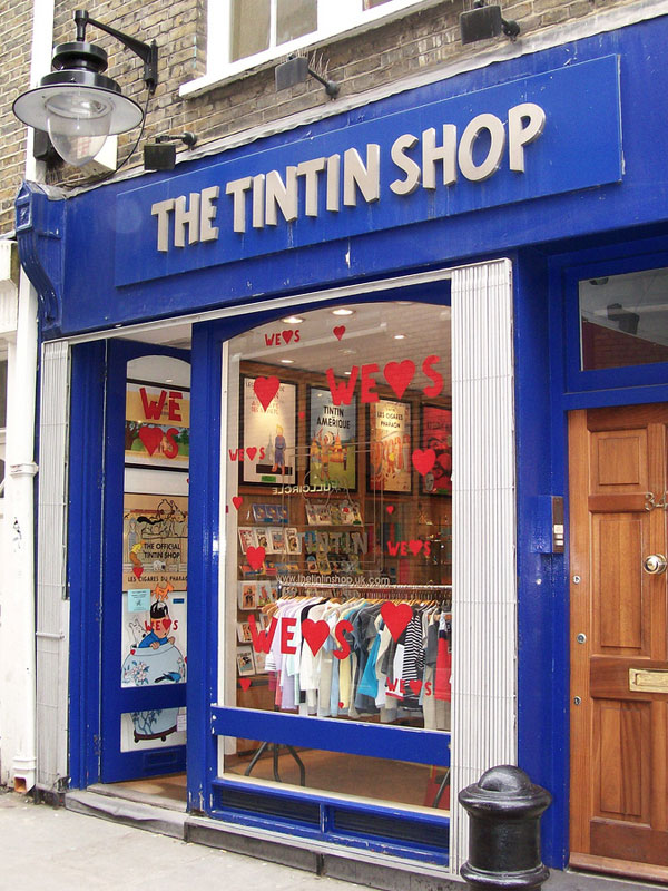 Tintin is the creation of the Belgian cartoonist, Hergé, who wrote and drew the Adventures of Tintin comics from 1929 up until his death in 1983. Tintin books have sold more than 200 million copies worldwide (in over 50 languages!) with only a scant percentage of those sales originating in the US. Officially sanctioned Tintin Shops—dedicated to nothing but Tintin merch—exist throughout Europe and Asia. There is even an entire museum, Musée Hergé, dedicated to the author and his famous creation. Tintin is as big as The Beatles, as big as Star Wars. Just not here in the US.
Tintin in America was my first foray into the series. The Native American iconography on the front cover was familiar, and Hergé’s drawings of their visible culture were absolutely gorgeous. Flip the book over and you’d find a gallery of covers to all 211 Tintin books. Each postage-stamp sized image promised an adventure equal to the one I held in my hand. These covers promised adventure, danger, and a portal into both history, and the future. They also induced me to run to my mom, begging her to buy me a copy right then and there. Along with Tintin in America, my personal favorites among the covers are Red Rackham’s Treasure with its awesome image of a submarine designed to look like a shark, and The Calculus Affair. That book appeared to be particularly dark with its image of Professor Calculus unconscious, and our heroes hidden behind a pair of large boulders. The frame of shattered glass only added to the sense of danger.


Each of the three covers above serve as an excellent example of Hergé’s drawing style dubbed ligne claire, or "clear line." Enlarge each cover for a closer look, and you’ll notice that Hergé uses the same line weight throughout his entire drawing, and that there is no shading. In cinematic terms, we can say that The Adventures of Tintin are rendered in deep focus. This line style doesn’t direct the reader’s eye to any one element, but encourages it to explore the entire image. When Hergé wanted to direct the reader’s eye he did so with close-ups, by changing the angle of the "camera," and by the way he positioned his characters in the frame. Let’s take a look inside Tintin in America to investigate Hergé’s cartooning style, and what makes it so good and so popular.
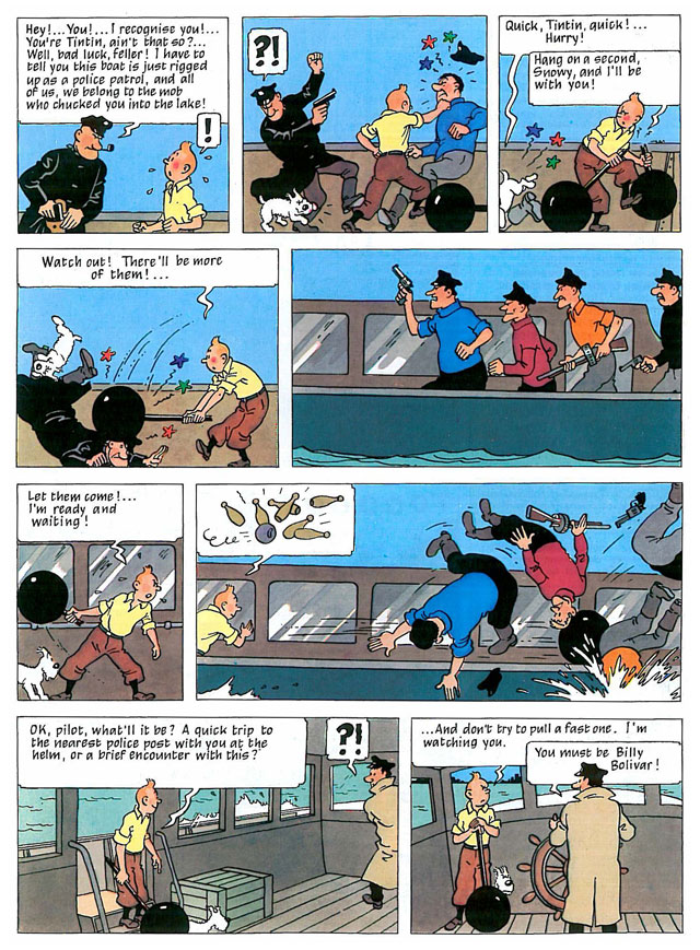
Every Tintin book is filled with clever storytelling, often emulating methods found in cinema. In the scene below, Hergé implies camera movement across three separate panels. The shot prompts the reader to wonder "What is Tintin looking at?" before the camera floats over his shoulder to provide the answer. Plus, the detail of Tintin standing on a pile of newspapers in order to see over the doors is both hilarious and a subtle way to illustrate how Tintin is always the little guy—literally and figuratively—in the fight. In storytelling terms, it’s a fantastic way to start a page (click the image to see the page in it’s entirety).

One of Hergé’s great strengths is his control of pacing. The pace of a Tintin tale is frenetic, rarely slowing down for breath. In comics, control over pacing is achieved through the arrangement and sizing of individual panels. This is not unlike the sensation of editing in a movie. A long, uninterrupted take is designed to make to viewer sense narrative time as similar to time in real life while a rapid succession of cuts will quicken a story or scene’s pace because it eliminates the time that existed between key images. In the sequence below, Hergé uses a quick series of panels as cinematic jump cuts to convey Tintin’s urgency in escalating the stairs to rescue Snowy. With each successive panel, Tintin is placed higher in the frame in order to show his progress. When Tintin finally arrives at the top in the fifth panel, Hergé relocates him at the bottom of the frame to help convey Tintin’s fatigue and desperation. The change in camera angle in the last panel also gives the reader a visual cue that this is the culmination of the current action (climbing the stairs), and the beginning of a new one (the rescue attempt).
 Take a look at the wonderful page to the right where Tintin chases the mobster, Bobby Smiles, on horseback (click to enlarge). The entire sequence is conducted through a series of panels that are roughly square in shape, three to a row, split across four rows (3 x 4 is Hergé’s default panel layout; variations occur when Hergé adjusts panel widths, or spans their height across multiple rows). The outcome of using small, consistently-sized panels is that the reader scans them faster, and perceives them as happening quickly. We see this in the horse chase sequence where the consistent panel width creates a consistent rhythm when read. In fact, the only panel that really alters the pace during the scene is the cut to a medium shot in panel nine where the closer perspective invites the reader to note that Tintin is about to take action with his lasso. Also, take a close look at the widths of the panels themselves and you’ll notice that they are not actually consistent from row to row. For an action packed page such as this, where each panel is roughly the same proportion, this effect helps keep the flow of the action feeling dynamic. Had Hergé gone with a rigid grid—all panels being exactly equal in width, and perfectly aligned—it would have rendered the scene more static. It’s a subtle design choice, but it makes a huge difference in the way we perceive the sequence.
More obvious than Hergé’s control over the pacing is his mastery of the cartooning itself. The horse chase began in panel six, which oriented Tintin as riding deeper into the image and Bobby Smiles as a mere speck in the distance. Panels seven and eight are designed as a cut between two shots—Tintin chasing Bobby, and Bobby shooting back at Tintin—but it is the spacial relations that were developed in panel six that help the reader understand that Bobby isn’t firing on Tintin from just a few feet away in panel eight. When Tintin accidentally causes his horse to trip in panel 10, the drawing isn’t of Tintin flying through the air or a close-up of his screaming face as we might expect to see if this were a movie. Instead, Tintin’s unintentional flight from his horse is illustrated by simply showing his feet as they chase his body out of the frame. This drawing is not only effective in conveying Tintin’s unexpected dismount in a single still image, it’s very funny. The scene ends with the final panel on the page, an image that conveys the reactions of all four characters (even Tintin’s horse) through iconography rather than words. Hergé’s command over storytelling technique is as good as anything you’ll ever see in comics.
 Tintin comics are largely comprised of panels that are not unlike most newspaper comic strips. Hergé’s drawings are mostly composed as long shots (meaning they show his characters’ entire bodies from head to toe) and medium shots (from about waist up), and the characters are typically oriented on the same plane of depth. But Hergé isn’t beholden to this style so much as he uses it in order to make his action sequences and moments of suspense that much more surprising. In the previous examples, we looked at how Hergé was able to manipulate pacing in order to make it flow faster, and to imply the speed of the chase. In the page to the right, you can see an instance where he does the opposite. By doubling the height of the panels where Tintin scales the side of the building, Hergé slows the reader down and prompts them to linger on the image. Furthermore, the angle of the composition in panel four—a stark break from the conventional, straight on shot—is absolutely dizzying, building suspense as we worry about Tintin’s safety. When Hergé changes the angle and cuts closer to Tintin in panel five, it helps relieve the suspense built in the previous panel. As you can see from all of these examples, Hergé is a master of dictating pace and controlling the way we perceive action.
One of the things that makes a Tintin comic a Tintin comic is the way the Hergé blends action and comedy, often in the form of slapstick much like you’d find in the films of Charlie Chaplin or Buster Keaton. In this gag, an unsuspecting bystander gets caught up in the action and taken on the ride of his life. The graphic match of the first and third image of the sequence (same person, same position, different vehicle) is made all the more funny by Hergé’s understanding of comedic timing; the slow pace of the cart and horse is interrupted by a train that is moving so fast that we never even saw the collision (and neither did the horse).

And in this example below, Hergé utilizes not only the outrageous possibilities afforded the cartoonist, but sound! When Tintin takes out this gang of thugs with half of a broken dumbbell, they comically scatter into the air. Tintin’s speech bubble expresses not a one-liner, but a picture of a bowling ball striking pins. When I read this panel, I hear the sound effect implied by the bowling image. It’s an unexpected and hilarious use of sound in a medium where the reader expects none, and it’s reminiscent of the chase sequence in René Clair’s Le Million that suddenly takes on the sound of a football game (as seen and heard at the 7:00 mark of this clip).
Tintin comics are funny, chock full of adventure, and feature some of the best storytelling in the history of early comics. They are beloved by young and old the world over. I know that when I see Steven Spielberg’s Tintin film, I’ll have a hard time judging it objectively; nostalgia will most certainly get in the way. Chances are that your experience will be quite different. But maybe, just maybe, the movie will be so good that it even inspires you to hunt down and read the comics. I think I’m going to go pull one off the shelf right now…
![]()
Notes:
- The first two stories, Tintin in the Land of the Soviets and Tintin in the Congo, were not widely distributed in America at the time.
One Comment
By natalie on November 17, 2015 at 10:43 PM
Great article!
Leave a Comment