
Variations on RED, White, & Blue Black
By Jason Haggstrom, October 15, 2010

 The movie RED opens in theaters today, but don’t take the fact that I’m commenting on it to be an indication that you should rush out to see it or anything. In fact, I’ve found that far more interesting than the prospect of the film itself is the variations between the French and American posters used to market it. Where the American posters overwhelm the senses with the iconography of violence and mayhem, the posters in France indicate that the film is something else entirely: a black comedy.
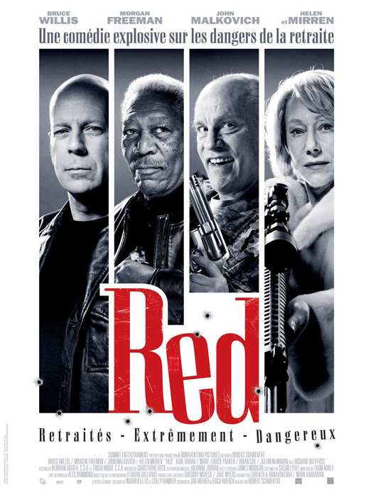
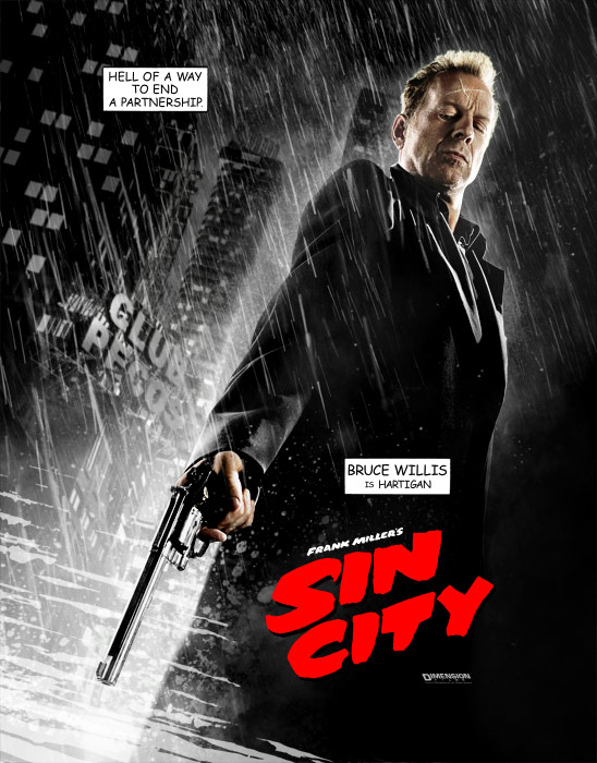
In the States, the film is being marketed with striking character-based one-sheets that emphasize the bloody implications of the film’s title. Those three letters, R-E-D, are given an entire third of the image space where they are rendered in a thick, all caps, italicized font. Tinted in shades of fire and blood, the posters also include details such as flying bullets and exploding shrapnel to accompany the grim faces and acrimonious taglines. Indeed, it would appear that the target audience for RED in America would be lovers of action films and fans of Sin City, Frank Miller’s celebration of the most violent aspects of noir. That film’s posters exhibited a similar conflation of violence-as-sex iconography and caustic sound bites rendered as printed words.


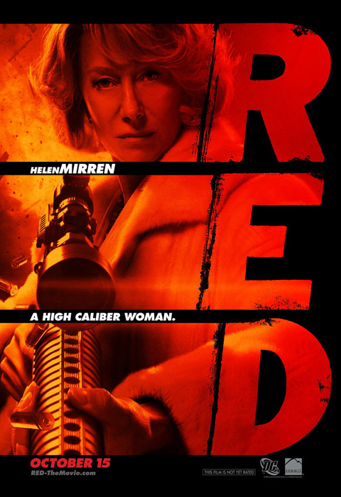
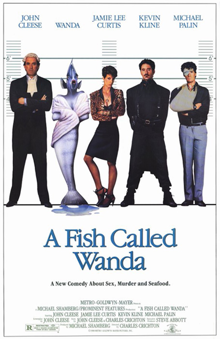
In sharp contrast to the American marketing for RED, the French poster is tinted in icy degrees of black, white, and gray with only a dash of rouge. Guns still abound, but there are no bullets, no fire, and no exploding shrapnel. John Huston’s black comedy, Prizzi’s Honor, is invoked by way of bullet holes that penetrate the printed image. The comedy of Jerry Lewis (whom the French are said to love much like Germans love The Hoff) is also implied by way of John Malkovich’s scene-stealing overbite. The poster’s assortment of near smirking faces also calls to mind the poster for the popular (and very British) comedy A Fish Called Wanda where its cast was caught in the most trouble-making of poses. That film promised to be "A New Comedy About Sex, Murder, and Seafood." Striking a similar tone, the French poster for RED comes right out and labels the movie as a comedy with its tagline, "An Explosive Comedy on the Dangers of Retirement." The off-kilter lettering of the film’s title—in stark contrast to the logo found on the American posters—further implies that the film’s violence will be colored by humor rather than gore. In fact, the only real similarity between the French and American posters is the presence of Dame Helen Mirren holding an extremely large gun. Warren Ellis, author of the comic book series the film is based upon, stated that "…if you don’t want to see a film with Helen Mirren with a sniper rifle, I’m not sure I want to know you." Apparently, some forms of iconography still resonate on both sides of the pond.


![]()
3 Comments
By rory dean on November 21, 2010 at 12:20 PM
Hey Jason,
Found you from your LAMb inclusion – welcome! I dig your post here, nice comparisons to U.S and foreign posters and the impressions they offer the viewer. I tend to find foreign advertising much more in sync with the prevalent theme(s) of the movie rather than basic marketing for marketing sake. I think U.S distributors often get it wrong, pushing a film into a category or demographic that is set up to fail from the beginning. The last thing anyone wants is to be told a film is a comedy or drama or sci-fi thriller then spend their money and find out fifteen minutes into the movie its nothing like what it is supposed to be. My biggest example would be The Full Monty, a film I really like and have yet written a review about but it is on my LIST, a film which was marketed in the U.S as a comedy and overseas as a drama. The point being, the film is hardly a comedy, though it does contain funny bits, and while it did pretty well at the box office it is apparent there are a lot of films out there that just don’t match up. And don’t get me started on movie trailers. That’s another story all together.
So all that to say, nice article, look forward to adding you to my feed reader. If you’re so inclined, drop by and see me some time at Above the Line.
cheers->
By Jason Haggstrom on November 21, 2010 at 3:18 PM
Thanks for stopping by and for the kind words. I like what you have to say about the different approaches to marketing. Too often, US movie posters avoid good design and, as you say, choose to focus on demographics and target markets by way of locking a film into genre, or by showcasing the actors. Modern posters seem to be filled with nothing more than just a bunch of floating heads. Even worse, they’re boring! Also love how you referred to having “The Full Monty” is on a giant to do list somewhere. I know the feeling. I’ve got a similar list as well with notes for dozens of future blog posts that I have yet to write!
By Megan on December 18, 2010 at 11:49 PM
As an avid movie lover but not-often-in-the-theater watcher (mostly due to time), I have to admit that I often refer to the poster to inform my rare theater-going excursions. Red is a perfect example of a movie I initially had no intention of seeing, based on its awful marketing posters, which do everything to hype the action while seemingly obscuring the stellar cast. Even their facial expressions are abrasive. I immediately marked it as the sort of Jean-Claude Van Damme flick for which I am definitely not the target audience. However, after seeing more closely the cast list, a fairly convincing movie trailer and, finally, the French version of the movie poster, I’d actually seek this movie out.
Leave a Comment