Creating a Poster: Tetsuo for President!
By Jason Haggstrom, December 9, 2011
This week,  the Large Association of Movie Blogs (The LAMB) is running a contest around the concept of "If A Movie Character Ran For President." The idea is for members to create and submit a poster (or modify an existing one) to match the theme. I don’t typically participate in such contests because my busy schedule prohibits it. But this time, I just couldn’t resist creating a submission. You see, I’m a big fan of Akira, both the 1988 film and Katsuhiro Otomo’s comic series (or manga, as comics are referred to in Otomo’s native Japan). I quickly realized that Akira‘s film’s power-mad protagonist, Tetsuo Shima, would be a great subject for this theme. Below, I’ll walk through the concepts that influenced my design, and then reveal the final poster that I submitted.
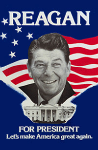
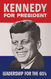
Now, the most obvious way to make this poster look Presidential is by using the color palette that stands for America (and, um, France, the UK, Russia… never mind): the good ‘ole Red, White, & Blue. When it comes to American political posters, it often seems like the question isn’t which colors will be used, but what shade. Add a giant head and tagline, and you’re done.
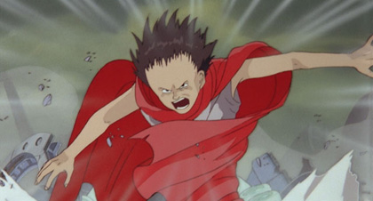
Because this is Tetsuo—who’d clearly be campaigning on a platform of world domination (and certainly sans running mate)—I wanted to go with a good headshot of him sneering or otherwise acting out on one of his many aggressive impulses. The image that immediately came to mind was from a favorite, yet long worn-out (and discarded), t-shirt that featured Tetsuo spinning around in rage. Although the shirt was long gone, the image was easy to source because it came directly from the film itself. Giant head acquired.
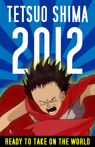
 If you scroll back up to those Presidential campaign posters for Obama, Reagan, and JFK, you’re bound to notice that stripes are also prominent elements in their design. I don’t think I have to tell you that the stripes, like the colors, are a semiotic reference to the American flag. But even though this poster design was an exercise in creating Americana, I knew that I had to retain some of element of Akira‘s Japanese origin in the design as well. I decided to go with the striking (and yet so simple) design of Japan’s wartime flag, the Rising Sun, with its 16 rays of red light in sharp contrast against a stark white sky. Because Tetsuo is already adorned in both red and white, I made the decision to alter the flag’s colors to blue in order to infuse the poster with the last of the three colors of the American flag. Once the Rising Sun was in place as the background for the poster, I realized that iconic presence of the flag not only referred back to the character’s Japanese roots, but also implied speed lines like those found in manga and anime. Bonus!
Red, White, & Blue color palette? Check.
Japanese iconography? Check.
Giant head? Check.
Now all I needed was a tagline. In the end, I decided to go with a slogan based off of the line Tetsuo delivers soon after discovering his newfound powers: "I feel like I could take on the world today!"
Here is the final, submitted design:
Like my design? Head on over to The LAMB and give me your vote!
![]()


One Comment
By Megan Haggstrom on December 9, 2011 at 10:16 PM
I’d be the first to vote for him. At least he would make Congress shake in their boots… unlike other candidates I can think of… If we could only get him to destroy only the bad guys.
Leave a Comment