By Jason Haggstrom, March 27, 2019
From the graphic simplicity of to the graphic complexity of , this is one of my favorite bunches of Looney Tunes and Merrie Melodies title cards. So few of the title cards feature characters in their designs and yet almost all of them stand out because of the unique nature of typography from card to card and the fantastic attention to detail featured in each painting. Even the more basic title cards such as —with its wonderful lettering and textured background—and —with its neon-inspired type—stand out as examples of great design by way of simplicity.
Continue reading…
By Jason Haggstrom, March 17, 2011
Following up on last month’s post on Looney Tunes & Merrie Melodies title cards from 1948-49, I bring you a gallery of title cards from 1950-51. Since today is St. Patrick’s Day, we’ll start with the title card for . While I wouldn’t call this one of the great title cards in the set, it does feature the iconic clover leaves that are so closely linked to today’s holiday. The cartoon itself involves a pair of leprechauns who torment Porky Pig in order to drive him away from their castle and prevent him from finding their pot of gold. Along the way, Porky is given a pair of magic shoes that force him to dance and that eventually chase him through a surreal, Dalíesque wasteland. The Wearing of the Grin was to be the final cartoon to feature Porky Pig in a starring, solo role and it’s a great one. Porky had been Warner Bros. animation’s first major star but had been supplanted first by Daffy Duck (a phenomenon that was even satirized in toon form in Friz Freleng’s You Ought to Be in Pictures), and then by Bugs Bunny. After The Wearing of the Grin, Porky was relegated to the role of "straight man" in pairings with Daffy Duck or the non-speaking, house cat version of Sylvester.
Continue reading…
By Jason Haggstrom, February 2, 2011
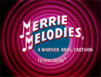
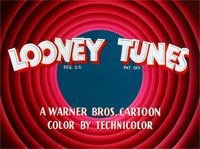
I have a real fondness for the title cards that precede animated shorts, especially those found in Looney Tunes and Merrie Melodies cartoons. Such title cards tend to feature the characters and settings in painted form which gives them a distinctly different look than how they appear within the cartoons themselves. The artists who worked on Looney Tunes and Merrie Melodies produced some of the most stylish and iconic title cards I’ve ever seen. Most of them are elegant works of art that feature terrific design work in composition, layout, and typography (which was lettered by hand!). They’re just plain fun to look at!
Continue reading…
 From the graphic simplicity of Baseball Bugs to the graphic complexity of Hollywood Daffy, this is one of my favorite bunches of Looney Tunes and Merrie Melodies title cards. So few of the title cards feature characters in their designs and yet almost all of them stand out because of the unique nature of typography from card to card and the fantastic attention to detail featured in each painting. Even the more basic title cards such as Rabbit Transit—with its wonderful lettering and textured background—and Slick Hare—with its neon-inspired type—stand out as examples of great design by way of simplicity.
