Maleficent: For the Love of Purple & Green…
By Jason Haggstrom, October 31, 2012
It’s October, and with the changes of Autumn come fall colors. Between the descending leaves and the presence of pumpkins, we’re accustomed to seeing plenty of orange and yellow at this time of year. But the Halloween season brings forth another, less natural combination of colors. It’s a union of colors that resonates with me more than any other. It’s that luscious pairing of purple & green.
I have the distinct memory of seeing Disney’s Sleeping Beauty in the theatre as a kid. IMDb lists Sleeping Beauty as being re-released in September of 1979 (it’s original run was in 1959), which would have made me 3½. Seeing that film for the first time, and in such a magnificent setting, was a formative experience.
Sleeping Beauty didn’t just win me over because of its dark story, its intricate-yet-abstract matte paintings, its elegantly wicked villain, or its spectacular finale. It also introduced me to the strange, phantasmagorical qualities of the purple & green color combination. Sinister and magical, regal and mysterious. It’s not a color combo that can be easily duplicated outside of comics, animation, or other mediums that are based on the abstraction of lines and fills rather than those that attempt to convey realism.

Memories of Sleeping Beauty would go on to haunt my childhood, and forever change the way that I experienced the winter skies. The Aurora Borealis is a common occurrence in my hometown of Fairbanks, Alaska. Most often, it appears across the night sky as a waving green ribbon with purple tips. It’s absolutely beautiful.
But after seeing Sleeping Beauty, I could no longer gaze at the Aurora Borealis without hearing the film’s ominous oboe and the accompanying vocal that hints at "Aurora… Aurora" as she’s led to the spindle. Creeped me out. That scene was likely my introduction to gothic horror. And I loved it.
Of course, Sleeping Beauty also featured Disney’s most sumptuous villain in Maleficent. She’s a typical Disney baddie—female, beautiful, evil incarnate and all that. And she’s even more perfectly realized by way of the delicious, sultry-sinister vocal performance by Eleanor Audley. But she also represents the pinnacle of Disney’s villain design (and she went on to be a not-so-subtle template for the wicked Ursula character in Disney’s The Little Mermaid 30 years later). Her horns imply a pact with the devil while her iconic staff gives a visual cue to the direction of her spite (and that makes one of the greatest of movie sounds each time that she pounds it into the stone floor):
Her magnificent cloak with its layers of black, purple, and red, and how they take the shape of a phoenix as she engulfs herself in a show of green fire:
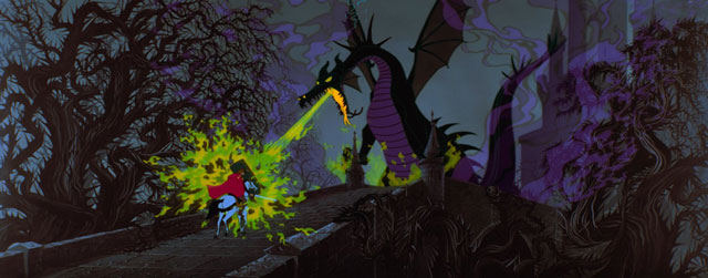
And if Maleficent wasn’t cool enough already, this gloriously beautiful film is highlighted by her ferocious, awesome transformation into a great dragon that blows acid-green fire:
Maleficent is the perfect embodiment of what it means to be purple & green.
This summer, the Internet was all abuzz over this first photo of Angelina Jolie in costume for the upcoming film titled, simply, Maleficent. This live-action Sleeping Beauty prequel is of the Wicked variety in that it centers on the days long before the infamous villain was known for being wicked, and long before her magnificent demise.
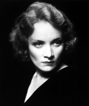
The photo looks great, especially the makeup and lighting design of her cheek bones. Jolie has the perfect look for this role, and we know that she’s quite capable of straddling the line between acting and Acting! that such a part would demand. It’s hard to think of an actress with a better face for this role. Of course, if we were picking from a list of the all-time greats, I’d have to lobby for Marlene Dietrich or Bette Davis:
But much like those images of Dietrich and Davis, the photo of Jolie as Maleficent is strikingly devoid of color. I mean, where’s the purple & green?! My way-too-early-despairing-freak-out-over-pre-production-materials was only compounded upon seeing this, the first photo of Jolie in costume on set:
I know it’s irrational, but this photo of Jedi Jolie has me worried. We’ve seen watered-down versions of outlandish costumes and characters before. Hell, they made three X-Men movies before finally realizing that the original, colorful costumes from the comics were totally bitchin’. No, black leather wasn’t nearly as cool as this:
Even the Green Goblin was compromised in Sam Raimi’s Spider-Man when they opted to give him shiny, goblin-lookin’ armor…
…even though they had this very true-to-the-comics version prototyped (purple hat intact!):
And as much as I enjoyed the costume and makeup design that went into The Joker in The Dark Knight…
…I have to say that this luscious celebration of my favorite color combination is just a bit more fabulous:
But it would seem that filmmakers are still concerned about going too far, and ending up with a travesty like this:
I, for one, want to see film studios take risks with color. Especially for a movie such as Maleficent. Make it explode with color! Bring on the purple & green!
Right now, I see my beloved color combination at every turn. But, alas, tomorrow it will be relegated to clearance bins extolling the power of half-off to those who can no longer be swayed by the allure of the mysticism of the purple & green pairing alone. Halloween’s primary orange—that nature-bound color that tricks us with the idea of warmth while painting itself to dying leaves—will get an extended shelf-life even after the last pumpkin has rotted away. And green will rise again as the store shelves turn over for the year’s final holiday. But purple will recede for another 11 months. Too royal or expressive for most, it’s a color that just doesn’t get enough play. Not even in the movies. Which is why I’ll be incredibly disappointed if, come March of 2014, the live action Maleficent doesn’t come bathed in colors as rich as these:
![]()


No Comments
Leave a Comment