By Jason Haggstrom, March 27, 2019
From the graphic simplicity of to the graphic complexity of , this is one of my favorite bunches of Looney Tunes and Merrie Melodies title cards. So few of the title cards feature characters in their designs and yet almost all of them stand out because of the unique nature of typography from card to card and the fantastic attention to detail featured in each painting. Even the more basic title cards such as —with its wonderful lettering and textured background—and —with its neon-inspired type—stand out as examples of great design by way of simplicity.
Continue reading…
By Jason Haggstrom, October 31, 2012
It’s October, and with the changes of Autumn come fall colors. Between the descending leaves and the presence of pumpkins, we’re accustomed to seeing plenty of orange and yellow at this time of year. But the Halloween season brings forth another, less natural combination of colors. It’s a union of colors that resonates with me more than any other. It’s that luscious pairing of purple & green.
I have the distinct memory of seeing Disney’s Sleeping Beauty in the theatre as a kid. IMDb lists Sleeping Beauty as being re-released in September of 1979 (it’s original run was in 1959), which would have made me 3½. Seeing that film for the first time, and in such a magnificent setting, was a formative experience.
Continue reading…
By Jason Haggstrom, February 25, 2012
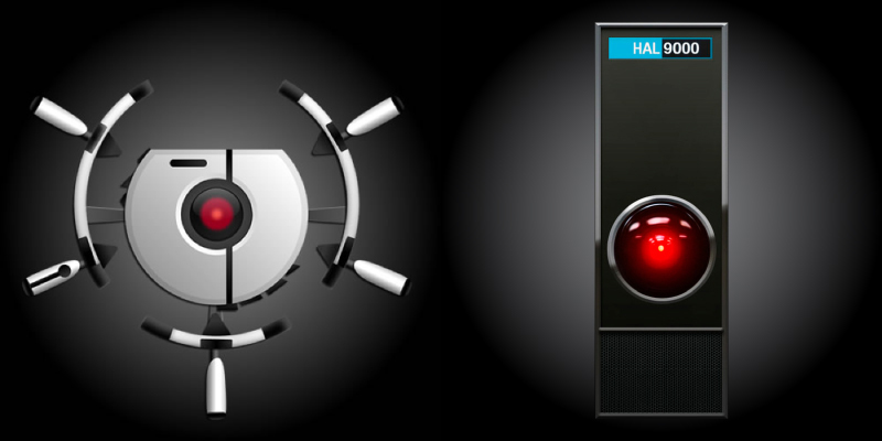
The films of Pixar are heavily populated with references to movies of the past, to the films most beloved by the studio’s many writer/directors. Consider WALL-E‘s villainous robot AUTO whose devilish red-eye brings to mind ; or The Incredibles‘ hilarious Edna as a ; or even A Bug’s Life whose entire plot—a defenseless village hires warriors to protect itself from bandits—is lifted right out of Seven Samurai. Most of these homages are created as comedy. They’re cinematic in-jokes for the initiated, connections that simply make one smile. But Pixar’s films are far greater than the sum of their homages. Most often they are great films, the kind that reveal hidden nuances with each additional viewing. Toy Story 2 is one such film.
Continue reading…
By Jason Haggstrom, March 17, 2011
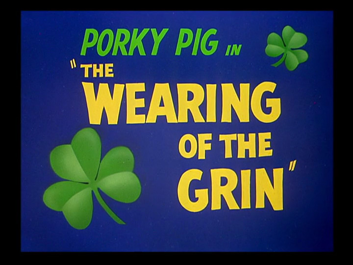
Following up on last month’s post on Looney Tunes & Merrie Melodies title cards from 1948-49, I bring you a gallery of title cards from 1950-51. Since today is St. Patrick’s Day, we’ll start with the title card for . While I wouldn’t call this one of the great title cards in the set, it does feature the iconic clover leaves that are so closely linked to today’s holiday. The cartoon itself involves a pair of leprechauns who torment Porky Pig in order to drive him away from their castle and prevent him from finding their pot of gold. Along the way, Porky is given a pair of magic shoes that force him to dance and that eventually chase him through a surreal, Dalíesque wasteland. The Wearing of the Grin was to be the final cartoon to feature Porky Pig in a starring, solo role and it’s a great one. Porky had been Warner Bros. animation’s first major star but had been supplanted first by Daffy Duck (a phenomenon that was even satirized in toon form in Friz Freleng’s You Ought to Be in Pictures), and then by Bugs Bunny. After The Wearing of the Grin, Porky was relegated to the role of "straight man" in pairings with Daffy Duck or the non-speaking, house cat version of Sylvester.
Continue reading…
By Jason Haggstrom, February 2, 2011
I have a real fondness for the title cards that precede animated shorts, especially those found in Looney Tunes and Merrie Melodies cartoons. Such title cards tend to feature the characters and settings in painted form which gives them a distinctly different look than how they appear within the cartoons themselves. The artists who worked on Looney Tunes and Merrie Melodies produced some of the most stylish and iconic title cards I’ve ever seen. Most of them are elegant works of art that feature terrific design work in composition, layout, and typography (which was lettered by hand!). They’re just plain fun to look at!
Continue reading…

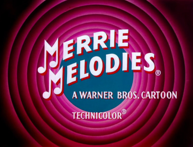 From the graphic simplicity of Baseball Bugs to the graphic complexity of Hollywood Daffy, this is one of my favorite bunches of Looney Tunes and Merrie Melodies title cards. So few of the title cards feature characters in their designs and yet almost all of them stand out because of the unique nature of typography from card to card and the fantastic attention to detail featured in each painting. Even the more basic title cards such as Rabbit Transit—with its wonderful lettering and textured background—and Slick Hare—with its neon-inspired type—stand out as examples of great design by way of simplicity.
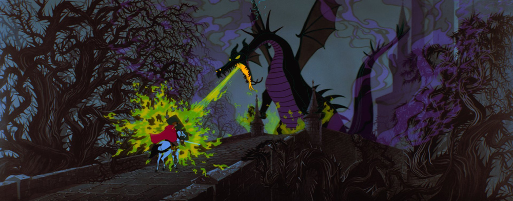
